Wednesday, March 31, 2010

Calligraphy, Envelope Addressing

Calligraphy by definition is "the art of beautiful handwriting".

When it comes to envelopes, in my opinion calligraphy is when an envelope is addressed by hand by a person who is skilled in hand writing and can produce writing that is elegant and consistent.
Calligraphy can be expensive to have done and rightfully so. It is labor intensive and does take a skilled hand.

The term calligraphy has been losely used in the wedding industry
for many other applications of addressing envelopes.
At Designs by Ginny we like to have fun with envelopes as the many samples below will show.
We have tons of fonts to choose from and
can most likely match the font of your invitation.
We also like to use a combination of fonts.
Some of the really decorative fonts make the actual address
hard to read so in those cases we like to use the fancy font
for the guests name and a simpler font for the address.
Unlike true calligraphy we are not limited to a few choices of fonts
and therefore can offer alot more options and have fun with the envelope.


The flower on the above envelope matched the flower on the invitation.


When we address your envelopes we also include
a return address on the back flap.
On this envelope we took one of the elements from the invitation
to create an envelope with a statement.
On the back flap we also included the logo
for Brides ala Mode next to their address.


This envelope will be fun to receive in the mail. The couple that the shower invitation is for met at Rack Room shoes so using a pair of shoes was very appropriate and complimented the invite.


The rehearsal dinner for this wedding was at a local restaurant
so we included the front door of the restaurant on the envelope.
How fun is that!


This envelope was just one of the envelopes in a stationery set.
Just makes you want to write a note to someone
so you can address the envelope.


Above are complimenting envelopes,
showing an outer envelope, the inner envelope
as well as a matching lining.


Above are 2 envelopes using monograms and bordered boxes.


Using your pet is so much fun. Above to the left is the envelope with the guest's address, then below one so the customer could address it herself for the extra invites she ordered just in case she forgot someone.
Then to to the right is a sample of the lining for Moe's envelopes.

We can do a coordinating lining for any envelope.


Isn't Buddy cute on this envelope. His owner ordered notecards with her and Buddy on them and we created a matching envelope for her using of course, her best friend, Buddy.


Yes, this is an envelope!
 The envelope is printed from edge to edge
show casing the customers front door.
The guest's address was printed on the walkway to the front door
making for an very unique envelope.
Don't you want to just walk right in!


Birthdays are always a special time
and you can see from both of these samples
 it doen's matter the age you can still have fun!


Just a couple more samples.

Above are just some of the different things we have done with envelopes.
We have covered them in fabric,
we have covered them in fancy papers,
we have made custom envelopes
so if you want something creative and unique
keep Designs by Ginny in mind.

Tuesday, March 30, 2010

Stricking Mango Calla Lily Invitation

This creative invitation was created for Maggie Bussmann who married Jonathan Dismuke over the Thanksgiving holiday. Maggie chose the colors of mango and wine for her wedding colors. We used those colors throughout all of her wedding stationary for a fanatastic looking wedding ensemble.


The cover of her foldover invite was graced with a large mango calla lily that was custom cut on the side for added drama.

When the invitation was opened the inside page was printed with a verse Maggie picked out.

The letter D and some custom scrolls added to the overall look of the invitations and wedding stationery.
When the invitation was completely open, the invitation was centered in the middle and a custom pocket was designed to the side to hold the response card, reception card and accommodations card.
White micah cardstock was used for the cover and invitation and a wine linen for the the backer behind the invite and the custom pocket.


The response card was a postcard response which is being utilized more with the cost of postage. Doing a postcard as opposed to a card and envelope saves money both the cost of the invitation ensemble and in the return postage that is required when sending out the invitation.
Another neat feature that Designs by Ginny offers is that on the response card instead of the traditional line where your guests fill in their name, their names are already printed on the cards so all they have to do is check the box saying whether or not they are attending. We have heard from past brides that some of the response cards will come in with no name on them and it is then a guessing game trying to figure out who the card came from. This eliminates any guess work.
Of course, the invitation wouldn't be complete without a lined envelope.
In this picture, the hotel guest were treated to a gift box filled with goodies. A welcome booklet was attached with a welcome from the bride and groom along with other weekend information. A beautiful silk bow, mango calla lily and greenery adorned the box for an impressive looking gift.


Also, included in the box of goodies was a water bottle with a custom label also created by
Designs by Ginny

Instead of the traditional numbers on the tables, Maggie and Jonathan choose different golf course to name all the tables. Small cards were made to match the table cards and inserted into envelopes that had the guest names printed on them. This is a good way to do the seating as you can have the cards printed up way ahead of time and just insert the correct card that correlates to the table the guest will be at and can be done at the last minute giving you the freedom of being able to change guest from one table to another if needed at the last moment.

Maggie"s menu card carried the same theme from her invitation and added lots of pizzazz to her table decor.

Maggie & Jonathan choose to donate to their favorite charities in lieu of guest favors and the style of this menu allowed for that information to be printed inside each menu.

A long slimline style program continued Maggie look.


And lastly, Maggie was able to thank her guests with a matching thank you card.


Piano Keys, Musical Notes create unique birthday card

Designs by Ginny had fun creating this truly unique custom birthday card.
The customer wanted a birthday card that was more than just a card but a reflection of the person and something that would be treasured and admired and not thrown away.
Music was an important part of Phyllis life and became the main focus of this card.

Alot of attention to detail was given in creating this card.
The card was wrapped using a silk musical note motif ribbon. A curved keyboard cleverly wrapped over the opening of the card. Two window boxes were used, one framing a picture of Phyllis and one framing the sheet music of the song, Happy Birthday.
Under the sheet music a watermark was placed with the number 80.


The sheet music was carried on the inside of the card to create an interesting background. A picture of Phyllis on a horse from her youth also created an unique backdrop behind a picture of Phyllis playing the piano. No detail was left undone as special picture was placed on the piano.
On each side flap other special pictures were added.


A special envelope was also created for the card,
using a high gloss cardstock and detailing it with the keyboard.


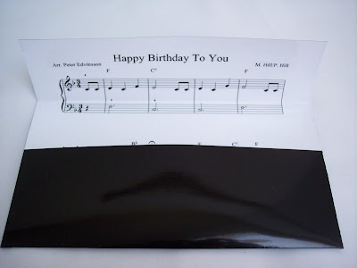
 The envelope was lined using the sheet music for Happy Birthday to You!

Purple pocket fold Invitation

Jodi & Shawn's invitation was created using a pocketfold from Envelopments.com. Jodi's colors are shades of purple, orange and pink. We were able to incorporate all these colors into her invitation.
The pocketfold is wrapped in a custom band printed using the pink metallic cardstock.
Inside the text was printed on an orange color metallic cardstock with purple text and a custom design added giving this invitation it's own personal look. The orange invitation card was mounted over the pink metallic cardstock tying all of Jodi's colors together. To keep with the look the accommodations card was printed on the pink cardstock keeping in character with the invitation.
Finishing the ensemble the invitation was sent in an coordinating orange envelope with purple calligraphy.

Dresser Mansion backdrop for this invitation


When Elizabeth received her invitations in the mail, she was delighted as they were just what she was envisioning. It is always scary when ordering online because you can't tell exact colors, textures or get dimensions and we work closely with our brides to arrive at just what they are looking for.
This invitation was created using all envelopment papers. Envelopments.com is a paper source that designers can access. They have a huge inventory of fine papers that are used to create a high end product. Envelopments are just releasing their new colors for 2010 and promise to be exciting.
Designs by Ginny also has other sources for many fine quality papers.
The invitation is wrapped in a beautiful red sheer silk ribbon and borders the couples initials that are printed on the cover of the invitation.
Keep in mind when purchasing an invitation with a bow or any type of embellishment that raises the envelope from laying flat that it will require extra postage.

Beth, liked an invitation that Designs by Ginny did for a previous customer using the ballroom of their event venue and wanted something similiar. Her wedding is taking place at the Dresser Mansion in Tulsa, Oklahoma. Her colors of orange and red make this invitation pop!


Using a border on the invitation and then mounting the invitation on the orange cardstock create more dimension to the inside of this invitation. Both the upper flap and lower flap of the foldovers were used for additional text.


A custom pocket was added to the back of the invite to hold the response card and Words of Wisdom cards. Beth wanted to do something different instead of a guest book and sent to her guest a card that they could fill out their words of wisdom or best wishes that she will make into her own personal guest book.